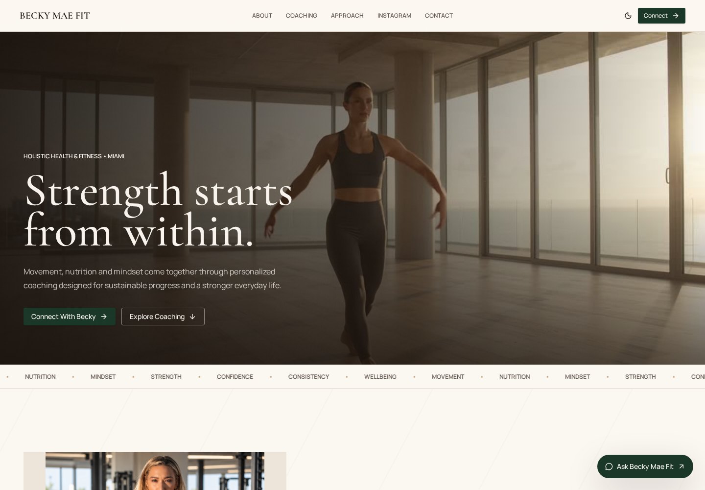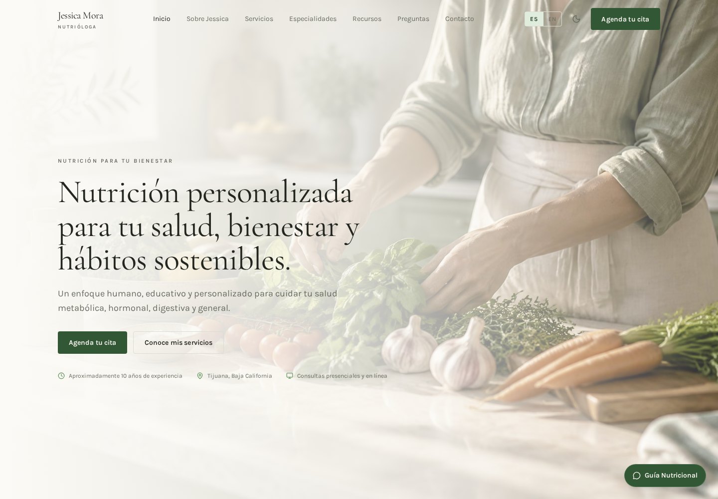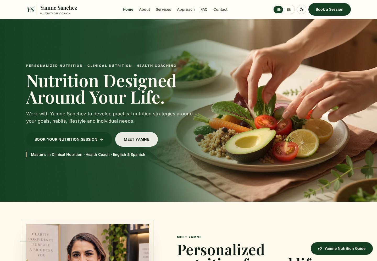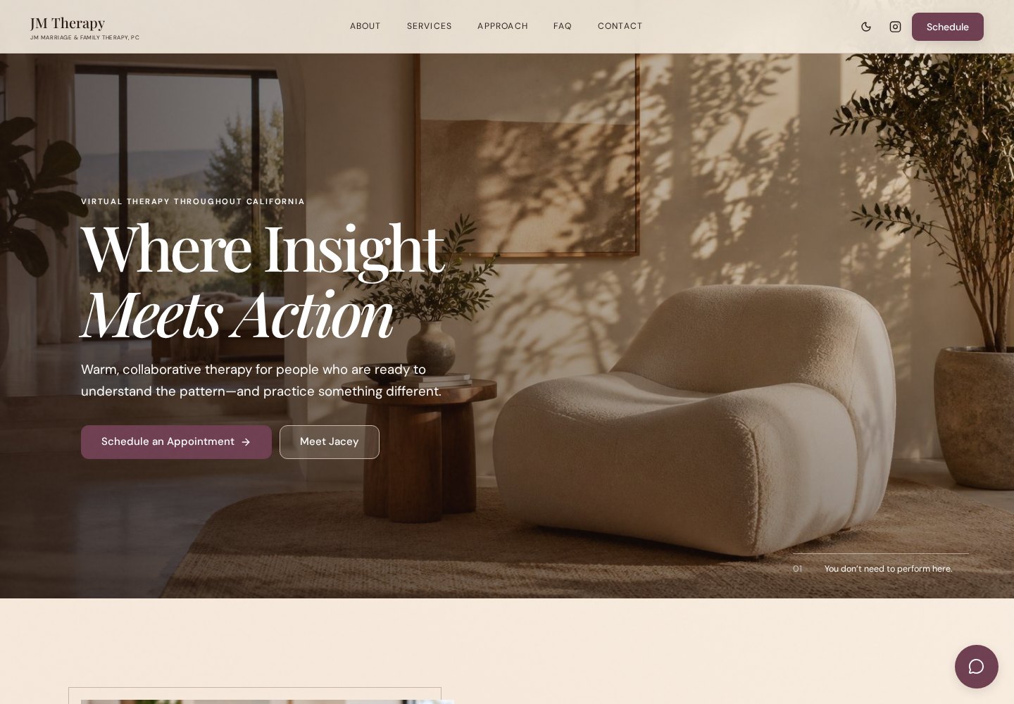
Credentials stated plainly
Licensure, modalities and the people you actually serve, written so a prospective client understands them in a few seconds.

Therapy & Private Practice
A therapy practice has to communicate calm, competence and boundaries before a single sentence is read. We design and build private-practice websites that present your credentials, your approach and your intake process with the same care you bring into the room — developed to load quickly, read clearly on a phone, and stay easy to maintain as the practice grows.
Case Study / Therapy
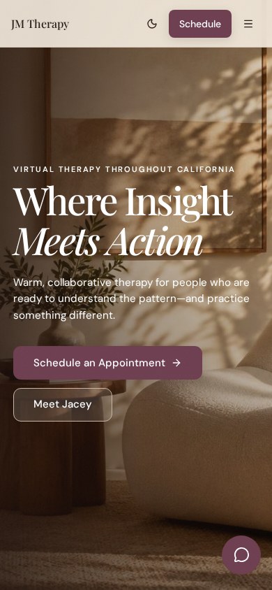
The practice introduces itself with a calm editorial statement rather than a sales pitch. Typography, spacing and imagery carry the authority, so the site reads as established before the page is scrolled, while the route from first impression to making contact stays short and unambiguous.
What the site has to hold
Someone reading it is usually nervous, comparing practices, and one scroll away from closing the tab. Every decision below is made with that person in mind.
Licensure, modalities and the people you actually serve, written so a prospective client understands them in a few seconds.
Restrained palette, generous space, unhurried motion. Nothing that raises the pulse of someone already anxious about reaching out.
Email, phone, WhatsApp or a booking link, reachable from every screen — including one-handed, on a phone.
Session formats, telehealth availability, fees and insurance questions answered before the first message is sent.
Most first visits happen on a phone, in private. Type, tap targets and media are built for that reality, not adapted to it afterwards.
Keyboard navigation, visible focus states, sufficient contrast, reduced-motion support and meaningful image descriptions.
Descriptive page titles, per-page metadata, a real sitemap and a structure Google can read and trust.
New service pages, articles or a second practitioner added later without rebuilding the whole site.
How the work happens
We start with the practice: who you serve, what you don't, how people currently find you, and what a good enquiry looks like.
Sitemap, hierarchy and the journey from first read to booked session are agreed before anything is designed.
Typography, palette, imagery and motion chosen to feel human and considered — never corporate or clinical-cold.
Clean responsive development with real content in place, tested at small screen widths, not just wide desktops.
Readability, pacing, accessibility and performance passes — the details that decide whether a site feels expensive.
Deployment, metadata, sitemap, analytics and Search Console connected, so the practice is findable from day one.
Adjacent work
Questions before starting
Your practice, presented properly.